 There are a ton of reasons to love Borderlands, but one of the things I appreciate the most about the game is its commitment to a visual language. Where do I go next? What doors can I open? What can be destroyed? What can hurt me in the environment? What kind of attack does that enemy have? How do I defeat this creature? Conveying the answers to all of these questions (and hundreds more) relies heavily on establishing consistent visual cues. If some doors can be opened and others can’t, the locked doors should look different. If a force field is going to hurt me when I run into it, that force field better warn me ahead of time by looking (and even sounding) dangerous. Not earth shattering insight, but something that’s very easy to forget in the quest to innovate or make beautiful art.
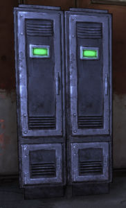
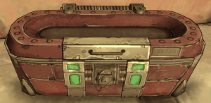
 Borderlands’ visual language includes many well-etablished conventions, including color-coding both loot (based on traditional RPG codes for rarity) and some enemies (based on the type of damage they deal: red for fire, blue for electricity, green for corrosive, etc.). But my favorite visual cue is the bright green light applied to every “treasure chest” in the game. While “Green Means Gold” has undoubtedly been used in other games, the consistency with which it’s used in Borderlands is impressive. Money, weapons, ammo, and other goodies can be found in a wide range of containers: lockers, red crates, small lock boxes, and even old washing machines and trash heaps. Built into every one of these (even the trash heaps) is some kind of bright green light. There’s a sense of glee (and maybe greed) when, after clearing an area of enemies, you look around and see a dozen green lights glowing from shadowy corners, through open doorways, behind fences, or on top of roofs. Each green light offers the promise of reward, ranging from a few bucks to a rare weapon you can’t wait to test out on the next group of enemies.
Seems like just a little thing, but often it’s the little things that prove most important.


I agree that Borderlands executed its visual language well. And I think what was even more important than the visual language on static and dynamic objects was the use of clear iconography in the world to guide the player. With even a large number of accepted quests in the mid to late game, I always knew where to go, what to do, thanks to the quest, map, and in-HUD indications of my mission objectives.
But what impressed me just as much was the execution of Diablo-style loot system with a near-perfect ratio of complexity to gameplay value.
This link (http://img338.imageshack.us/img338/6207/borderlands200911012208.jpg) is a screenshot of a mid-level, weapon. As much info as Borderlands packs into the weapon display, it struck me as just enough variation to produce a lot of ramping acquisition gameplay, but nothing about what it can do is unclear. And the clear display of the weapon value always provided me with a good basic sense of the designer’s opinion of equipment value.
The principle of RPGs: Numbers go up. Profit.